HTML Forms
Apart from describing the structure of text documents, the HTML language can be used to create forms. However, HTML is not capable of processing those forms, so another part of the technology stack must be used for that. So again, this will be slightly boring, because you can’t do much with HTML forms alone.
Form elements must be contained in the form element, otherwise they won’t work. This
is particularly nasty because the form element is not rendered (which means it is
invisible) and therefore it is hard to detect that you have forgotten to use the
form element.
Form controls
There are many form control types and there are some differences in support among various browsers (Firefox is a bit behind in this). See CanIUse for current information about the feature support.
The following list shows the most common (and useful) form controls and some very useful attributes of those controls.
Many form inputs are created using the input element. The input element has no content, so
it’s written in using shorthand tags <input ...>. The type of the input is determined by the
value of the type attribute. Therefore to create a text form input, use:
<input type='text'>Labels
Good accessibility practice recommends that all HTML inputs have
labels. This is not always honored, but unless you have some really strong reasons, you should always use labels.
Labels are particularly useful for checkbox and radio input types, where they ease
selecting the options as the user can click the text (and does not need to aim for the check-mark itself).
There are two methods to associate a label with an input. Either the input element must be contained in the
label element or they are linked using the for and id attributes.
Method 1
<label>Enter your name:
    <input type='text'>
</label>
Method 2
<label for='firstName'>Enter your name:</label>
<input id='firstName' type='text'>
Name and Value
When processing HTML forms, the browser only
sends the server name and value pairs for
each form control. This means that is quite important to know what is the name and value of each
element and how they produce the name – value pairs.
For most form controls, the name of the control must be unique within the form element. This means that
across different forms, the form elements may be the same, but inside a single form you must not use the same name twice,
because the value of one form control would overwrite the value from the other form control. A notable
exception to this are buttons
and radio-buttons, where the name does not need to be unique.
Common attributes
Apart from the name and value, most controls have attributes:
required– When used, the end-user must enter a value in the control.readonly– When used, the end-user cannot change the value of the control, she can however focus the control (put the cursor into it) and e.g. copy a text from the control.disabled– When used, the end-user cannot interact with the control in any way.id– A unique identifier of the HTML element, used for linking labels.
Button
Button is an important part of the form, as it actually allows the end user to send a form.
Button is best created with the button element. Button should have a type attribute with a value:
submit– Standard button for submitting a formreset– Button for resetting the form to the default state (and make end-user angry)button– Button which does nothing (button must be handled by JavaScript)
Button has the name and value attributes. However, if a form has multiple buttons, only the button which has been
actually clicked, will be sent by the browser. Buttons are used without the label element.
<form method='post' action='http://odinuv.cz/form_test.php'>
    <ul>
        <li>
            <button type='submit' name='buttonAgree' value='yes'>I agree</button>
        </li>
        <li>
            <button type='submit' name='buttonAgree' value='no'>I don't agree</button>
        </li>
        <li>
            <button type='submit' name='buttonOther' value='someValue'>Another button</button>
        </li>
    </ul>
</form>Basic Text Input
As shown above, the text input is created by specifying the type='text' attribute. Use the
text input for input of an arbitrary text. The name of the
form control is defined by the name attribute. The input element has no content, so there
is no end tag for the input element. Other useful attributes are:
value– for providing a default value of the inputplaceholder– for providing a placeholder (e.g. sample value)required– to trigger validation that a value must be entered
<form method='post' action='http://odinuv.cz/form_test.php'>
    <ul>
        <li>
            <label>Input with a default value:
                <input type='text' value='John Doe' name='inputWithDefaultValue'>
            </label>
        </li>
        <li>
            <label>Input with a placeholder:
                <input type='text' placeholder='Name Surname' name='inputWithPlaceholder'>
            </label>
        </li>
        <li>
            <label>Required input:
                <input type='text' required='required' name='requiredInput'>
            </label>
        </li>
        <li>
            <label>Input without special attributes:
                <input type='text' name='commonInput'>
            </label>
        </li>
    </ul>
    <button type='submit'>Submit</button>
</form>You can create a password input (input is hidden by asterisks) by specifying
type='password'. Apart from blocking the visible input, it behaves the same
as the text input. Note that the contents of the password input are visible
in the source of the HTML page though.
Number Input
The input for entering a number is created by specifying the type='number' or the type='range' attribute.
The name of the form control is defined by the name attribute. Other useful attributes are:
value– for providing default value of the inputrequired– to trigger validation that a value must be enteredmin– a minimum value of the numbermax– a maximum value of the numberstep– a step by which the number can be increased
<form method='post' action='http://odinuv.cz/form_test.php'>
    <ul>
        <li>
            <label>Number input:
                <input type='number' name='inputNumber' required='required'>
            </label>
        </li>
        <li>
            <label>Number input with limits:
                <input type='number' name='inputNumberLimits' min='0' max='100' step='10'>
            </label>
        </li>
        <li>
            <label>Range Number input:
                <input type='range' name='inputRange' min='100' max='200'>
            </label>
        </li>
    </ul>
    <button type='submit'>Submit</button>
</form>Date input
There is a number of predefined inputs for entering date and time values. Some of those are not supported among all web browsers yet (e.g. Firefox). Predefined date input types are:
date– for entering just a datedatetime-local– for entering a date with time (including current timezone)time– for entering just time (no timezone, because there is not date)week– for entering just a week of a yearmonth– for entering just a month of a year
<form method='post' action='http://odinuv.cz/form_test.php'>
    <ul>
        <li>
            <label>Date:
                <input type='date' name='dateInput'>
            </label>
        </li>
        <li>
            <label>Date with time:
                <input type='datetime-local' name='datetimeInput'>
            </label>
        </li>
        <li>
            <label>Time Input:
                <input type='time' name='timeInput'>
            </label>
        </li>
        <li>
            <label>Month Input:
                <input type='month' name='monthInput'>
            </label>
        </li>
        <li>
            <label>Week Input:
                <input type='week' name='weekInput'>
            </label>
        </li>
    </ul>
    <button type='submit'>Submit</button>
</form>Advanced Text Input
If you need the end user to enter a value, but it fits into none of the above
input types (number and date), you can use more specialized inputs such as
type='email' or type='url' which validate the end-user input. If you
need something even more customized, you can build your own validation using a
combination of attributes:
minlengthfor providing a default value of the inputmaxlengthfor providing a placeholder (e.g. sample value)patternto trigger validation that a value must be entered
<form method='post' action='http://odinuv.cz/form_test.php'>
    <ul>
        <li>
            <label>Input with a default value:
                <input type='text' value='John Doe' name='inputWithDefaultValue'>
            </label>
        </li>
        <li>
            <label>Input with a placeholder:
                <input type='text' placeholder='Name Surname' name='inputWithPlaceholder'>
            </label>
        </li>
        <li>
            <label>Required input:
                <input type='text' required='required' name='requiredInput'>
            </label>
        </li>
        <li>
            <label>Input without special attributes:
                <input type='text' name='commonInput'>
            </label>
        </li>
    </ul>
    <button type='submit'>Submit</button>
</form>Checkbox
Checkbox is suitable for getting a boolean value from the end-user. As all
the above controls, checkbox is also identified by the name attribute. The
value attribute is usually set to 1. When the checkbox is ticked, the
web browser sends the value (1), when the checkbox is not ticked, the
web browser does not send anything (acts as if there wasn’t a checkbox in
the form). To make the checkbox checked by default, use the
checked='checked' boolean attribute.
Try it in the following example:
<form method='post' action='http://odinuv.cz/form_test.php'>
    <ul>
        <li>
            <label>I agree with everything
                <input type='checkbox' value='1' name='checkboxAgree'>
            </label>
        </li>
        <li>
            <label>I agree with nothing
                <input type='checkbox' value='1' checked='checked' name='checkboxNoAgree'>
            </label>
        </li>
    </ul>
    <button type='submit'>Submit</button>
</form>When using a checkbox, it is important to use the label element, so that the
label text is clickable.
Radio Button
Radiobutton is suitable for choosing between few mutually exclusive values.
For few values, it is better than a select box because it saves the
end-user a click. There are a couple of exceptions to the radiobutton behavior.
First, the name attribute of the radio button is used to define a radio group.
Radio-buttons within the same radio group are mutually exclusive – this means that the
name should not be strictly unique. Each button in the radio group must have
a unique value within that group, because the web browser will send the name of the
radio group with the value of the selected radio button. As with the checkbox, to
have a radiobutton pre-selected, use the boolean attribute
checked='checked'. You can test it in the following examples:
<form method='post' action='http://odinuv.cz/form_test.php'>
    <ul>
        <li>Gender:
            <label>Male
                <input type='radio' value='male' required name='radioGender'>
            </label>
            <label>Female
                <input type='radio' value='male' required name='radioGender'>
            </label>
        </li>
        <li>
            Colour:
            <label>Red
                <input type='radio' value='red' checked='checked' name='radioColour'>
            </label>
            <label>Green
                <input type='radio' value='green' checked='checked' name='radioColour'>
            </label>
            <label>Blue
                <input type='radio' value='blue' checked='checked' name='radioColour'>
            </label>
        </li>
    </ul>
    <button type='submit'>Submit</button>
</form>When using the radio button, it is important to use the label element, so that the
label text is clickable.
Select
The select element allows the user to choose from multiple options. To create a select element,
there are actually two HTML elements used: select for the select itself and option for
individual options. The select element has the name attribute and, the option element
has the value attribute. The content of the select element are option elements and
the content of the option element is the actual text of the option.
To have an option pre-selected, you can use the selected attribute
(yes, that is different to the checked used
in the checkbox and radiobutton).
The feel and look of the select element can be controlled by attributes:
size– a number of visible items. When the size is equal to 1 (default), the select is displayed as a drop-down select.multiple– a boolean attribute to allow selecting of multiple elements.
<form method='post' action='http://odinuv.cz/form_test.php'>
    <ul>
        <li>
            <label>Colour:
                <select name='colourSelect'>
                    <option value='red'>Red</option>
                    <option value='green'>Green</option>
                    <option value='blue' selected>Blue</option>
                </select>
            </label>
        </li>
        <li>
            <label>Colour:
                <select name='colourSelectList' size='5'>
                    <option value='red'>Red</option>
                    <option value='green'>Green</option>
                    <option value='blue' selected>Blue</option>
                </select>
            </label>
        </li>
        <li>
            <label>Colour:
                <select name='colourSelectListMultiple[]' size='5' multiple>
                    <option value='red'>Red</option>
                    <option value='green'>Green</option>
                    <option value='blue' selected>Blue</option>
                </select>
            </label>
        </li>
    </ul>
    <button type='submit'>Submit</button>
</form>When using multiple, make sure to append [] to the element name, so that the value of the
element is sent as an array. Otherwise, only the first value would be sent.
Textarea
Textarea allows the end-user to enter a multi-line text. Textarea has the attribute name, the
value of the element is actual element content, so there is no value attribute. The textarea
requires rows and cols attributes which define the number of rows and characters in each
row allowed in the textarea. A default value for textarea is entered simply as the element content.
The content of the textarea element is one of the few places in HTML, where whitespace is important.
<form method='post' action='http://odinuv.cz/form_test.php'>
    <ul>
        <li>
            <label>Order description:
                <textarea name='descriptionText' rows='10' cols='40'></textarea>
            </label>
        </li>
        <li>
            <label>Product description:
                <textarea name='productText' rows='2' cols='40'>This is the best product ever made.
You certainly want to buy it.</textarea>
            </label>
        </li>
    </ul>
    <button type='submit'>Submit</button>
</form>Inside textarea whitespace matters, therefore the line You certainly want to buy it must not be indented.
Task – Form in a list
Now try to create the following form. I used a list for arranging the form controls in rows.
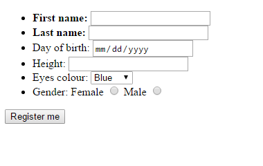
<!DOCTYPE html>
<html>
<head>
    <meta charset='utf-8'>
    <title>Registration form</title>
</head>
<body>
<form method='post' action=''>
    <ul>
        <li>
            <label><strong>First name:</strong>
                <input type='text' name='firstName' required>
            </label>
        </li>
        <li>
            <label><strong>Last name:</strong>
                <input type='text' name='lastName' required>
            </label>
        </li>
        <li>
            <label>Day of birth:
                <input type='date' name='dayOfBirth'>
            </label>
        </li>
        <li>
            <label>Height:
                <input type='number' min='50' name='height'>
            </label>
        </li>
        <li>
            <label>Eyes colour:
                <select name='eyeColour'>
                    <option value='blue'>Blue</option>
                    <option value='green'>Green</option>
                    <option value='brown'>Brown</option>
                    <option value='other'>other</option>
                </select>
            </label>
        </li>
        <li>Gender:
            <label>Female
                <input type='radio' name='gender' value='f'>
            </label>
            <label>Male
                <input type='radio' name='gender' value='m'>
            </label>
        </li>
    </ul>
    <button name='register' value='register'>Register me</button>
</form>
</body>
</html>
Task – Form in a table
Now try to create the following form. Here I used a table for arranging the form controls in rows.
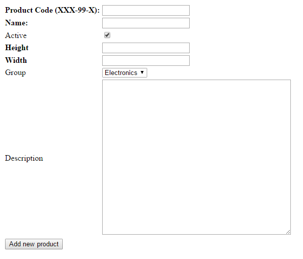
<!DOCTYPE html>
<html>
<head>
    <meta charset='utf-8'>
    <title>New Product</title>
</head>
<body>
<form method='post' action=''>
    <table>
        <tr>
            <td><strong><label for='productCode'>Product Code (XXX-99-X):</label></strong></td>
            <td><input type='text' id='productCode' name='code' required pattern='[A-Z]{3}-[0-9]{2}-[A-Z]'></td>
        </tr>
        <tr>
            <td><strong><label for='productName'>Name:</label></strong></td>
            <td><input type='text' id='productName' name='name' required></td>
        </tr>
        <tr>
            <td><label for='productActive'>Active</label></td>
            <td><input type='checkbox' id='productActive' name='active' checked></td>
        </tr>
        <tr>
            <td><strong><label for='productHeight'>Height</label></strong></td>
            <td><input type='number' name='height' id='productHeight' min='1' required></td>
        </tr>
        <tr>
            <td><strong><label for='productWidth'>Width</label></strong></td>
            <td><input type='number' name='width' id='productWidth' min='1' required></td>
        </tr>
        <tr>
            <td><label for='productGroup'>Group</label></td>
            <td>
                <select id='productGroup' name='group'>
                    <option value='EL'>Electronics</option>
                    <option value='HH'>Household</option>
                    <option value='CL'>Clothing</option>
                </select>
            </td>
        </tr>
        <tr>
            <td><label for='productDescription'>Description</label></td>
            <td><textarea id='productDescription' name='description' rows='20' cols='50'></textarea></td>
        </tr>
        <tr>
            <td colspan='2'>
                <button type='submit' name='add' value='add'>Add new product</button>
            </td>
        </tr>
    </table>
</form>
</body>
</html>
Summary
Now you should be able to create HTML forms with many different controls. Keep
in mind that forms cannot be processed by the HTML language, so far none of the
forms can actually do anything. When creating HTML forms, it is important to
know what the name and value of each control is, and how they behave when
the form is actually submitted (because there are some differences between the
controls). Also keep in mind that if you have form elements outside the form tag,
they will be displayed as usually, but they will not be working
(the control will not be sent to the server).
You can also look at a full list of HTML elements to see what else HTML can offer to you.
New Concepts and Terms
- Form
- Control
- Name & Value
- Control Label
- Control Validation
Control question
- Are
actionandmethodattributes mandatory? - What happens when you submit a form without
actionattribute? - How does browser transfer information from form to backend?