CSS - Bootstrap
In the previous chapter I have explained the CSS basics. You should know that CSS is a language which is used to set graphical properties of HTML elements. You should also be able to read CSS files and understand them. In this part of the book I will show you how to save some work and use freely available predefined CSS styles. I strongly suggest that you start with some predefined styles, because making your own (good looking) styles requires a lot of work. I will also briefly introduce responsive design.
This text is strongly aimed at the Bootstrap software library at version 4.x. It is certain that in future trends will change and/or a new version of Bootstrap will be released.
Bootstrap
I recommend to use the CSS framework called Bootstrap. It can deliver a nice modern look for your application without having to worry about writing too much CSS code.
Obtaining it is easy – you just download the whole package, unzip it, and link main Bootstrap CSS and JS files in your HTML headers. You should also download and link jQuery library if you want to use modal windows or menu dropdowns and other effects.
There are more CSS frameworks available online – e.g.:
I will use the Bootstrap version 4.x here because it is best known and I like it. The above frameworks offer similar features to Bootstrap, so the choice is rather arbitrary.
Linking Bootstrap to your application is simple. Go to the download page
and copy those few lines from the Bootstrap CDN section.
You can also download the whole Bootstrap in a zip archive if you want. You just need to link bootstrap.min.css and
bootstrap.bundle.min.js in your <head>. If you want to use Bootstrap locally, make sure not to break the Bootstrap
directory structure. If you want to use Bootstrap’s JavaScript features, you should also link
the jQuery library (also available via CDN)
before bootstrap.bundle.min.js (always use the latest compressed production version). With all this, the beginning of
your HTML document should look like this:
<!DOCTYPE html>
<head>
    <meta charset="utf-8">
    <title>My new page</title>
    <link rel="stylesheet" href="bootstrap/css/bootstrap.min.css">
    <script src="jquery-3.3.1.min.js"></script>
    <script src="bootstrap/js/bootstrap.bundle.min.js"></script>
</head>
<body>
...
</body>
</html>
Tables, forms, inputs, pagination, navigation…
A large part of the Bootstrap framework is a library of CSS definitions for basic HTML elements. You can find samples in the documentation section. Bootstrap has many classes and applying them on your HTML elements will make those elements look “the Bootstrap way”.
For example a button can be styled with the btn and btn-primary class.
<button class="btn btn-primary">
    This is a blue button.
</button>
<button class="btn btn-success">
    This is a green button.
</button>
The code class="btn btn-primary" simply assigns two classes (btn and btn-primary) to the
HTML element. Do not confuse this with a space in a CSS selector.
Another example is a table which has every second row a bit darker. This can be achieved with the following CSS classes:
<table class="table table-striped table-hover">
    <tr>
        <th>Header row 1</th>
        <th>Header row 2</th>
    </tr>
    <tr>
        <td>row</td>
        <td>1</td>
    </tr>
    <tr>
        <td>row</td>
        <td>2</td>
    </tr>
    <tr>
        <td>row</td>
        <td>3</td>
    </tr>
</table>
As you see, the Bootstrap CSS classes are split into general and specific.
For example, the table or btn class is a set of CSS definitions common for all tables or buttons. Other classes cause the
elements to behave in a more specific way – e.g. a green button with btn-success or a blue button with btn-primary.
The class table-striped is for alternating white and grey rows in a table and the class table-hover makes useful highlight for
a row which is under the mouse cursor. This approach resembles the principle of inheritance/specialization of classes
from object oriented programming.
The CSS classes for HTML forms are probably the most complicated because Bootstrap offers many layouts for your forms (horizontal, inline) and most forms are usually composed of many elements. In the components section you can find more complicated elements – for example navbars (navigation bar), cards, pagination, badges and navigation elements.
Make sure to have a look at navbar component. It has quite
a complicated HTML code and uses many CSS classes, but if you work carefully and remove unwanted elements you can
get a nice navigation in your application (you can use navbar-dark bg-dark classes to have a black one).
Task – Use Bootstrap
Try to apply Bootstrap CSS classes to your application HTML code and make it look modern. Hint: use the
<div class="container"> or <div class="container-fluid"> element to enclose all your HTML content.
The solution is different for each of you. Although the Bootstrap elements look the same, the placement and selection of alternatives will make your application unique. You probably have a few forms and some tables in your application. You should use only the CSS classes from Bootstrap to apply styles. Try to place some elements into wells or use panels and alerts.
Combining custom CSS with Bootstrap
Although it is very complicated, Bootstrap is nothing more than CSS. So all of the CSS rules
still apply. This means that you can easily override anything defined in Bootstrap. However, because Bootstrap is a
library (and other people develop it), you should avoid changing anything in the
bootstrap files directly. If you want to override something in Bootstrap, link another CSS file in your <head> section.
Remember to put your custom CSS as the last <link> tag to override Bootstrap’s CSS definitions.
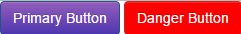
Task – Override Bootstrap
Try to change the default blue color of the primary button to violet (#935ebc) and the danger button color to sharp
red (#db0808).
Your HTML should look like this (custom CSS styles have to come last to overwrite Bootstrap styles):
<!DOCTYPE html>
<head>
    <title>Override Bootstrap</title>
    <link rel="stylesheet" href="https://maxcdn.bootstrapcdn.com/bootstrap/3.3.7/css/bootstrap.min.css">
    <link rel="stylesheet" href="https://maxcdn.bootstrapcdn.com/bootstrap/3.3.7/css/bootstrap-theme.min.css">
    <link rel="stylesheet" href="my-styles.css">
    <script src="https://maxcdn.bootstrapcdn.com/bootstrap/3.3.7/js/bootstrap.min.js"></script>
</head>
<body>
    <button class="btn btn-primary">Primary Button</button>
    <button class="btn btn-danger">Danger Button</button>
</body>
In the linked CSS file (my-styles.css), you simply define what you want to change:
.btn-danger {
	background: #ff0000;
}
.btn-primary {
	background-image: linear-gradient(to bottom,#935ebc 0,#4e36af 100%);
}
If you are not sure, where a particular CSS property (background and background-image in this case) is defined, you can always
find the right place using the Developer tools.
Responsive design
With the growth of mobile devices market share, creators of web pages were challenged to make web pages usable both on PCs with large screens and also on small handheld devices. Also this must be done preferably with as much shared code as possible. The key is to apply different CSS properties depending on the screen resolution or other parameters of the device using a media query.
You can use a media query to apply certain CSS properties only when some conditions are met.
File media-queries.css:
/* this CSS is used for all devices */
body {
	background-color: #888888;
	font-size: 12pt;
}
@media screen and (min-width: 800px) {
	/* CSS for larger screens */
	body {
		padding: 4rem;
	}
}
@media screen and (max-width: 799px) {
	/* CSS for smaller screens */
	body {
		padding: 1rem;
		background-color: lightblue;
	}
}
@media print {
	/* CSS for printers */
	nav {
		display: none;
		background-color: white;
	}
}
In the above example, the padding of the page is changed with the browser window size. Try it for yourself on the following piece of HTML code.
File media-queries.html:
<!DOCTYPE html>
<head>
    <title>Override Bootstrap</title>
    <link rel="stylesheet" href="media-queries.css">
</head>
<body>
    <p>Some text</p>
    <nav>This won't print (try print preview)</nav>
</body>
You should see that as you resize the browser window the padding will change. I have also added a change of background color
to make the trigger more apparent. The above example also shows that media queries are often used to control what
gets printed on web pages. For print output, you usually want to hide navigation and forms
and also background images (in this above style I set background to plain white and the nav element not to print).
CSS pixel – some devices with very small screen pixels (high density displays) can be configured to count four (2x2), nine (3x3) or even sixteen (4x4) screen pixels as one CSS pixel. This makes the CSS unit px usable to measure screen size and set dimensions of elements because the CSS pixel is approximately equally large on all devices (say ~0.5mm).
Using media queries, you can set different CSS rules for different situations and the HTML code can remain almost unchanged. This makes it possible to create pages with responsive design. Altogether this is a powerful tool, thanks to it you can even create a mobile application which can be installed on your phone with pure HTML, CSS and (a lot of) JavaScript. This type of application is called hybrid application and its advantage is a shared codebase for web and all mobile platforms.
Using Bootstrap to make your page responsive
Again, to define all possible scenarios and write media queries by yourself can be quite a challenge.
Bootstrap comes with predefined responsive behavior: it divides the page to 12 vertical columns and you
can define how many columns would an element occupy in 5 different screen size intervals (e.g. in a small
screen resolution you can make a <p> element 6 columns wide and for larger resolutions you can save some
space and make it only 2 columns wide). The key is to use the Bootstrap responsive module correctly:
<!DOCTYPE html>
<head>
	<meta charset="utf-8">
	<title>My new page</title>
	<link rel="stylesheet" href="https://stackpath.bootstrapcdn.com/bootstrap/4.1.3/css/bootstrap.min.css" integrity="sha384-MCw98/SFnGE8fJT3GXwEOngsV7Zt27NXFoaoApmYm81iuXoPkFOJwJ8ERdknLPMO" crossorigin="anonymous">
	<script src="https://stackpath.bootstrapcdn.com/bootstrap/4.1.3/js/bootstrap.min.js" integrity="sha384-ChfqqxuZUCnJSK3+MXmPNIyE6ZbWh2IMqE241rYiqJxyMiZ6OW/JmZQ5stwEULTy" crossorigin="anonymous"></script>
	<script src="https://ajax.googleapis.com/ajax/libs/jquery/3.3.1/jquery.min.js"></script>
</head>
<body>
<!-- always use .container or .container-fluid -->
<div class="container">
	<!-- to use responsive classes define a row -->
	<div class="row">
		<!--
			sum of columns occupied by elements for each
			resolution should be <= 12
		-->
		<p class="col-6 col-md-2 border">
			This paragraph is 6 columns wide for small screens and 2 columns wide for larger ones.
		</p>
		<p class="d-none d-sm-none d-md-block col-md-10 border">
			This one is even hidden for small screens.
		</p>
	</div>
	<div class="row">
		<!-- do not apply col-*-* classes on styled elements, always use spare <div> to define columns -->
		<div class="col-4 border">
			<label>A way to make inline form</label>
		</div>
		<div class="col-4 border">
			<input class="form-control" />
		</div>
		<div class="col-4 border">
			<button class="btn btn-primary btn-block">
				A block button
			</button>
		</div>
	</div>
	Extra small:
	<div class="row">
		<div class="col-4 border">4 of 12</div>
		<div class="col-4 border">4 of 12</div>
		<div class="col-4 border">4 of 12</div>
	</div>
	Small:
	<div class="row">
		<div class="col-sm-4 border">4 of 12</div>
		<div class="col-sm-4 border">4 of 12</div>
		<div class="col-sm-4 border">4 of 12</div>
	</div>
	Medium:
	<div class="row">
		<div class="col-md-4 border">4 of 12</div>
		<div class="col-md-4 border">4 of 12</div>
		<div class="col-md-4 border">4 of 12</div>
	</div>
	Large:
	<div class="row">
		<div class="col-lg-4 border">4 of 12</div>
		<div class="col-lg-4 border">4 of 12</div>
		<div class="col-lg-4 border">4 of 12</div>
	</div>
	Extra large:
	<div class="row">
		<div class="col-xl-4 border">4 of 12</div>
		<div class="col-xl-4 border">4 of 12</div>
		<div class="col-xl-4 border">4 of 12</div>
	</div>
</div>
</body>
</html>
Screen size intervals for Bootstrap responsive classes:
- none – extra small – under 576px (excl.) –
col-* - sm – small – from 576px to 768px (excl.) –
col-sm-* - md – medium – from 768px to 992px (excl.) –
col-md-* - lg – large – over 992px to 1199px –
col-lg-* - xl – large – over 1200px –
col-xl-*
CSS Pre-processors
If you feel that CSS with its flat structure and lack of variables can get out of hands after some time, you are not alone! For this purpose CSS pre-processors were invented – most popular pre-processors today are LESS and Sass. This is too advanced to start with, just try to remember this information for your first big project. Also the Bootstrap library is written with Sass (it used to be written in LESS).
LESS/Sass is a kind of programming language that can be used to generate static CSS. You can use Sass to compile your own Bootstrap – with your own colors and responsive breakpoints etc. thanks to variables which are used in Bootstrap’s source code.
Icons
Previous version of Bootstrap framework offered some basic icons. Bootstrap 4 removed all icons and it is up to you
to obtain some icon set for you application. I recommend free version of Font Awesome.
You can connect the stylesheet using CDN
or download the whole package and link CSS file locally – you only need css and webfonts folder. Be careful not to
break directory structure. Link the all.min.css file in <head> of your document. Icons are accessed using fa and
fa-* classes:
<!-- button with floppy disk icon -->
<button class="btn btn-primary" type="button">
    <span class="fa fa-save"></span> Save
</button>
Be careful not to put text into the span element itself. It looks ugly.
Summary
In this chapter you have used Bootstrap CSS framework to make your application look modern. I have also introduced you to media query and you should know what is it used for. You should be able to specify at least a simple CSS for printers.
You may feel sad that your app does not have a unique design. That is true, but remember that useful application is not made only of nice colours and pretty pictures. Sometimes even the coolest effects can get tiring when they slow down the user.
Try to design usable layouts and controls first and then try to think how people will react to your ideas. Do not hesitate to inspire yourself from the work of others. Each website is done by different team of designers and visitors have to adapt and sometimes a new idea may confuse them. Try to follow well known patterns and practices.
New Concepts and Terms
- Bootstrap CSS framework
- Responsive design
- Media query
Control question
- How to apply custom CSS (override Bootstrap)?
- Is Bootstrap a good solution for your company’s information system?
- Is Bootstrap a good solution for your company’s website?
- Is Bootstrap a good solution for presentation of an graphician/artist?
- How can you use Bootstrap or Font Awesome (or both) in your project?
- Are there any alternatives to Bootstrap?
- Are there any alternatives to Font Awesome?