Layout Modes
Layout Modes
So far I have explained how the web browser (or more precisely its rendering engine) determines values of different CSS properties. When this is done, the rendering engine may start actually drawing the HTML elements on the screen. The first step in drawing the elements is determining their sizes and positions. This is done using a layout engine, which can operate in several layout modes:
- block layout – by default used for block elements (
p,table,ul,ol,div, …),- float layout – a flavour of block layout in which elements are stacked into lines,
- column layout – a flavour of block layout in which elements are stacked into columns,
- inline layout – by default used for inline elements (
a,img,span, …), - table layout – used for contents of table (the
tableitself is a block element), - positioned layout – in this layout, the elements are positioned by their coordinates, without interaction with other elements,
- flex layout (flexible box layout) – in the layout the boxes are able to change their size to best accommodate the screen,
- grid layout – allows positioning elements in a fixed grid (this is different to table in that a table is a dynamic grid – it accommodates to content)
The flex layout and grid layout are the newest additions to CSS layouts. Grid layout is not very well supported among browsers yet, but there are already some guides on using it. Keep in mind that layout mode is specified per element (not per document), which means that all the layout modes can be mixed in a single document. Let’s have a quick look on the basic properties and usage of different layout modes.
CSS Box Model
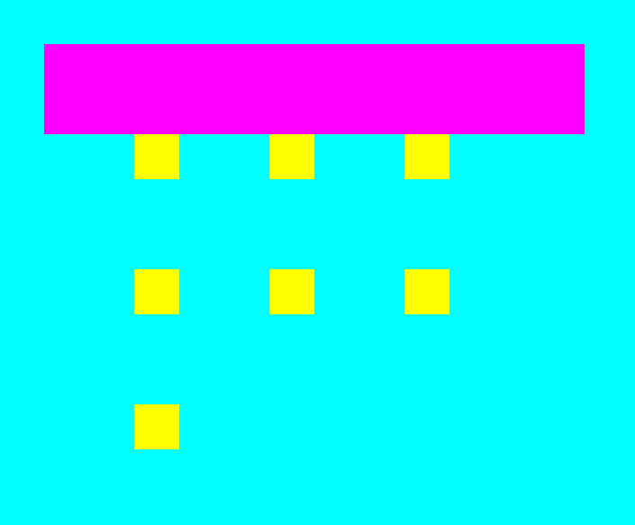
Before we get to the layout modes, it is important how CSS handles HTML elements. Each element on a page is represented as a rectangular box (even if it has round corners) with four edges:
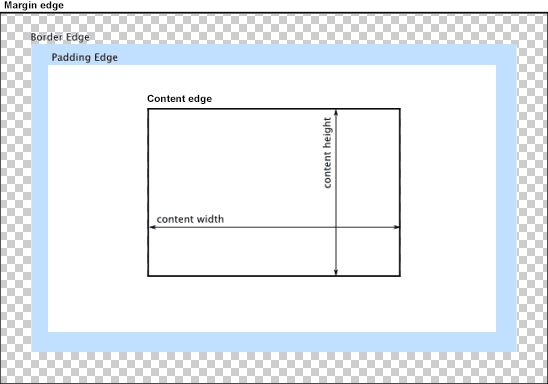
The edges are computed from the element content.
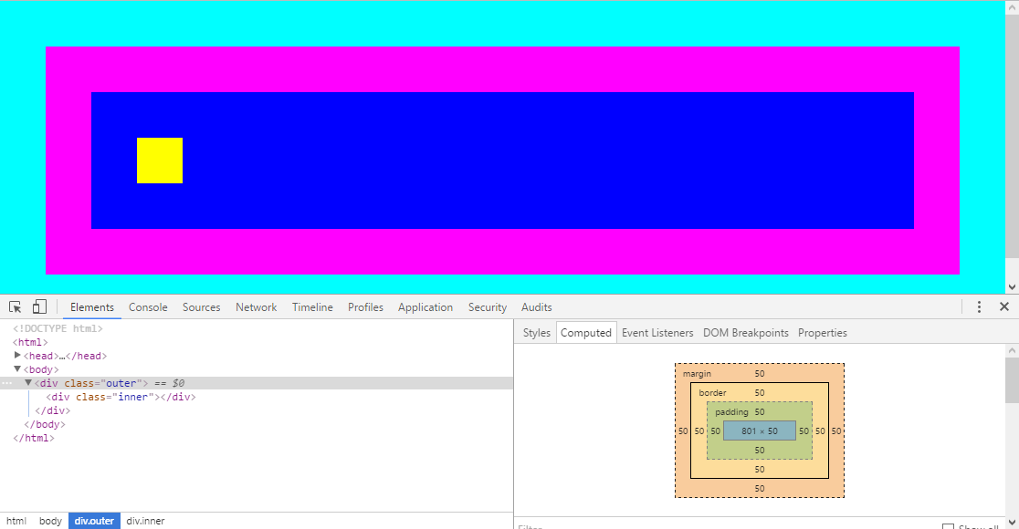
In the following example, the inner div size is 50 × 50 pixels. So that is the
size of content of the outer div (yellow box is the content edge). To that, the
element padding is added (another 50 pixels). Padding is spacing between the element content and
element border, therefore it has the background color of the parent element (it acts as if it were part of the content).
The blue rectangle defines the padding edge.
The last part of the element is the magenta border (another 50 pixels). Border is placed outside
the element content. The magenta rectangle shows the border edge.
Outside of the element is the margin (another 50 pixels). Margin is spacing outside of the element – between the element border and its parent content edge. The cyan rectangle shows the margin edge. The margin edge determines the total space occupied by the HTML element on screen.
<!DOCTYPE html>
<html>
    <head>
        <meta charset='UTF-8'>
        <title>Sample page</title>
        <link rel='stylesheet' href='style-10a.css'>
    </head>
    <body>
        <div class='outer'>
            <div class='inner'></div>
        </div>
    </body>
</html>body, html {
margin: 0;
background-color: cyan;
}
.inner {
background-color: yellow;
width: 50px;
height: 50px;
}
.outer {
background-color: blue;
padding: 50px;
border: 50px solid magenta;
margin: 50px;
}Therefore, to calculate how much space an HTML element will occupy on a screen, you need to add content, padding, border and margin dimensions together. Feel free to experiment wit the page in your browser developer tools.
Block layout
Now you probably wonder, why the .outer div above is not square. This is because a div is a block level element
and block level elements occupy (unless specified otherwise) the entire space of their parent. In this
case this is body which by default has width and height set to automatic. Automatic width (width: auto) means that the
element occupies all available horizontal space of the parent element. Automatic height (height: auto) means that the
element has height to accommodate all of its children.
You can fix that by setting .outer width to e.g. 50px. Now this may sound weird, the actual visible element width
is 2 ✕ 50 (border) + 2 ✕ 50 (margin) + 50 (content size) = 250 px. I.e. setting the width
to 50px actually results in element width being 250px. This is as designed – look at the box model schematic
above – the CSS width property refers to the content width (content edge). What happens if you
set the width to more than the content width (e.g. 150px) ?
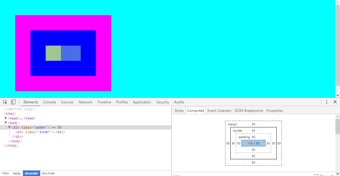
The content size was extended, but the content (obviously?) was not. That’s simply because the .inner div
has set width to 50px and no border or padding. This means that the space between the .inner margin edge
and .outer content edge was extended. You can see it blue because there is nothing in it, so you can see
through to the parent element (.outer), which is blue. This is also why width: 100%
does something else than you might expect.
Try removing the width of the .inner element, can you guess what happens?
The inner element spreads to entire content of the parent element (width: 150px).
To center the .inner div, add display: flex; justify-content: center to the .outer div.
What happens if you make the content smaller? I also made padding smaller, so that the behavior is more visible:
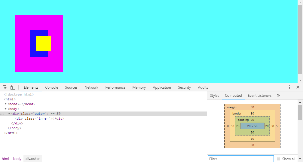
As you can see, the .inner element width remained 50px wide and it overflowed the designated space
in .outer div. By default, the overflow is visible. You can control what happens with the overflow
(of .outer div) by setting overflow property. Try setting it to hidden or to scroll.
Notice that the overflow does not include the padding (because that is not part of the content) –
i.e. the overflow refers to the content edge.
The above describes the basic behavior of positioning and sizing block elements. In a simplified way it can
be described that a block element accommodates to the size of its parent. Or in other words, that a parent
block defines the space which its children can occupy. Block layout is used for block elements or elements
with display: block property. Keep in mind that block layout is vertically oriented – height: auto and
width: auto behave differently.
This is because HTML was designed for text documents which naturally expand vertically.
Float layout
Block layout can be greatly modified by using floats. I have added more boxes and slightly
modified the CSS (.inner now has margin).
<!DOCTYPE html>
<html>
    <head>
        <meta charset='UTF-8'>
        <title>Sample page</title>
        <link rel='stylesheet' href='style-11a.css'>
    </head>
    <body>
        <div class='outer'>
            <div class='inner'></div>
            <div class='inner'></div>
            <div class='inner'></div>
            <div class='inner'></div>
            <div class='inner'></div>
            <div class='inner'></div>
            <div class='inner'></div>
        </div>
    </body>
</html>body, html {
margin: 0;
background-color: cyan;
}
.inner {
background-color: yellow;
width: 50px;
height: 50px;
margin: 50px;
}
.outer {
background-color: blue;
border: 50px solid magenta;
margin: 50px;
width: 500px;
}
Notice that the boxes are stacked below each other. This is because block layout favors vertical flow – i.e. it is assumed that a block level element occupies entire ‘line’ of screen (even if it really does not). This is typical for text documents. When you put a table or figure (that is block element) in an a text, you usually want it to occupy the entire width of the document. If not, you can modify the by setting it to float.
When you set float: left to the .inner div. You should see this:
All the .inner elements floated out of the parent .outer div. Which shrank to zero height, this is
why the blue area disappeared. It still has width 500px however, because that it defined in the style, so
all you see is 500px wide and 50px thick magenta border. The floated .inner elements then stack starting from
top left corner. Notice that they still maintain the position and width of the .outer element (the top
left yellow box is in exact same position as in the previous example). This may look like a weird behavior –
the elements are placed outside of their container, yet they respect its size (except height which overflows).
Why does float behave so strangely? Because that is exactly what it is expected to do.
Float was designed for positioning block elements in a flow of text, see how a figure looks without float, I used Lorem Ipsum text to fill the page:
<!DOCTYPE html>
<html>
<head>
<meta charset='UTF-8'>
<title>Sample page</title>
<link rel='stylesheet' href='style-12a.css'>
</head>
<body>
<article>
<p>
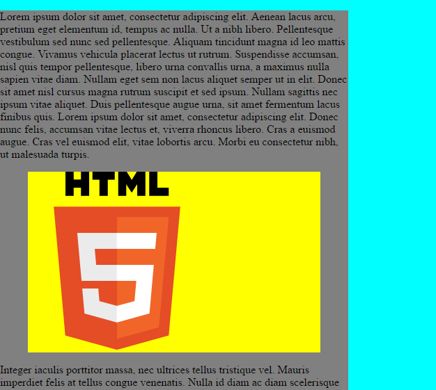
Lorem ipsum dolor sit amet, consectetur adipiscing elit. Aenean lacus arcu, pretium eget elementum id, tempus ac nulla. Ut a nibh libero. Pellentesque vestibulum sed nunc sed pellentesque. Aliquam tincidunt magna id leo mattis congue. Vivamus vehicula placerat lectus ut rutrum. Suspendisse accumsan, nisl quis tempor pellentesque, libero urna convallis urna, a maximus nulla sapien vitae diam. Nullam eget sem non lacus aliquet semper ut in elit. Donec sit amet nisl cursus magna rutrum suscipit et sed ipsum. Nullam sagittis nec ipsum vitae aliquet. Duis pellentesque augue urna, sit amet fermentum lacus finibus quis. Lorem ipsum dolor sit amet, consectetur adipiscing elit. Donec nunc felis, accumsan vitae lectus et, viverra rhoncus libero. Cras a euismod augue. Cras vel euismod elit, vitae lobortis arcu. Morbi eu consectetur nibh, ut malesuada turpis.
</p>
<figure class='left'>
<img src='https://www.w3.org/html/logo/downloads/HTML5_Logo_256.png' alt='HTML 5 Logo'>
</figure>
<p>
Integer iaculis porttitor massa, nec ultrices tellus tristique vel. Mauris imperdiet felis at tellus congue venenatis. Nulla id diam ac diam scelerisque scelerisque. Ut tempor auctor nibh, vitae porta orci tempor ac. Mauris dolor mi, porttitor at venenatis vitae, tempus sed risus. Suspendisse sit amet consequat erat. Mauris aliquam quam non est convallis, in viverra elit sagittis. Quisque vestibulum porta dolor. Donec quis risus in ligula sollicitudin dictum ac a turpis. Pellentesque mattis id nibh commodo fringilla. Sed a posuere ligula. Phasellus nec augue vulputate, pharetra elit a, fringilla purus.
Phasellus vel varius orci, nec vestibulum nunc. Ut metus quam, scelerisque ut consectetur ut, tincidunt sed nunc. Integer dapibus massa non arcu molestie iaculis. Fusce pretium scelerisque augue. Vestibulum dignissim neque mi, quis porttitor purus varius non. Aenean nec auctor magna. Nunc non lorem dictum, accumsan diam eget, facilisis nunc. Fusce imperdiet placerat est, eget auctor nisi ultricies non. Ut ac felis rutrum, malesuada lectus eget, tincidunt nisl. Morbi cursus lorem eu est suscipit pulvinar. Cras elit justo, condimentum non risus nec, efficitur pulvinar sem. Proin viverra mauris eu elit consequat lacinia. Etiam tincidunt vehicula metus in ornare.
Sed quis ipsum porta, malesuada lectus ac, hendrerit felis. Vestibulum ante ipsum primis in faucibus orci luctus et ultrices posuere cubilia Curae; Etiam ullamcorper augue in turpis tincidunt, nec interdum purus volutpat. Ut at magna at nibh efficitur feugiat. In sed ipsum lectus. Nunc eleifend quam id neque semper, sed cursus eros dictum. Donec elementum, neque eu ultrices vulputate, metus sapien condimentum ipsum, vel aliquet lacus diam vel lectus. Vestibulum sed commodo nibh. Nunc in volutpat eros. Quisque condimentum ultrices pulvinar. Vestibulum venenatis efficitur orci id suscipit. Nam varius arcu sit amet cursus faucibus. Donec fermentum orci dolor, id porttitor turpis consequat vel.
</p>
<figure class='right'>
<img src='https://www.w3.org/html/logo/downloads/HTML5_Logo_256.png' alt='HTML 5 Logo'>
</figure>
<p>
Phasellus accumsan volutpat leo, quis rutrum urna posuere et. In egestas ullamcorper nibh, quis dapibus dui porttitor nec. Mauris eu neque a nunc faucibus auctor finibus ut risus. Integer a ipsum quam. Morbi euismod urna vitae neque consequat varius eget vel magna. Sed facilisis faucibus sapien, ut faucibus ex iaculis vitae. Donec gravida arcu laoreet massa cursus, a tincidunt neque feugiat. Morbi lectus nisl, tristique vitae tellus vel, consectetur rutrum velit. Quisque sit amet ipsum luctus, sollicitudin diam id, fringilla ligula. Donec semper dignissim elementum. Aliquam at facilisis nibh, nec accumsan diam. Cras gravida ipsum vitae feugiat tristique. Maecenas euismod fringilla risus non pretium.
</p>
</article>
</body>
</html>body, html {
margin: 0;
background-color: cyan;
}
article {
background-color: grey;
width: 500px;
}
figure {
background-color: yellow;
}
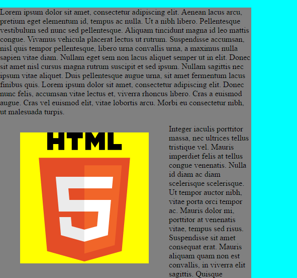
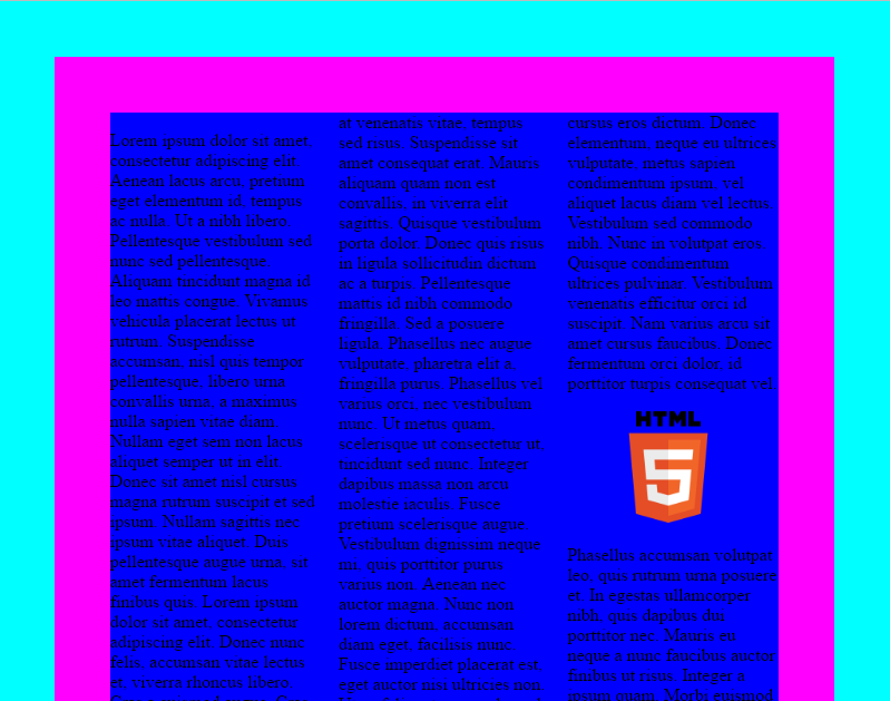
And now, lets float the figures:
<!DOCTYPE html>
<html>
    <head>
        <meta charset='UTF-8'>
        <title>Sample page</title>
        <link rel='stylesheet' href='style-12b.css'>
    </head>
    <body>
        <article>
            <p>
                Lorem ipsum dolor sit amet, consectetur adipiscing elit. Aenean lacus arcu, pretium eget elementum id, tempus ac nulla. Ut a nibh libero. Pellentesque vestibulum sed nunc sed pellentesque. Aliquam tincidunt magna id leo mattis congue. Vivamus vehicula placerat lectus ut rutrum. Suspendisse accumsan, nisl quis tempor pellentesque, libero urna convallis urna, a maximus nulla sapien vitae diam. Nullam eget sem non lacus aliquet semper ut in elit. Donec sit amet nisl cursus magna rutrum suscipit et sed ipsum. Nullam sagittis nec ipsum vitae aliquet. Duis pellentesque augue urna, sit amet fermentum lacus finibus quis. Lorem ipsum dolor sit amet, consectetur adipiscing elit. Donec nunc felis, accumsan vitae lectus et, viverra rhoncus libero. Cras a euismod augue. Cras vel euismod elit, vitae lobortis arcu. Morbi eu consectetur nibh, ut malesuada turpis.
            </p>
            <figure class='left'>
                <img src='https://www.w3.org/html/logo/downloads/HTML5_Logo_256.png' alt='HTML 5 Logo'>
            </figure>
            <p>
                Integer iaculis porttitor massa, nec ultrices tellus tristique vel. Mauris imperdiet felis at tellus congue venenatis. Nulla id diam ac diam scelerisque scelerisque. Ut tempor auctor nibh, vitae porta orci tempor ac. Mauris dolor mi, porttitor at venenatis vitae, tempus sed risus. Suspendisse sit amet consequat erat. Mauris aliquam quam non est convallis, in viverra elit sagittis. Quisque vestibulum porta dolor. Donec quis risus in ligula sollicitudin dictum ac a turpis. Pellentesque mattis id nibh commodo fringilla. Sed a posuere ligula. Phasellus nec augue vulputate, pharetra elit a, fringilla purus.

                Phasellus vel varius orci, nec vestibulum nunc. Ut metus quam, scelerisque ut consectetur ut, tincidunt sed nunc. Integer dapibus massa non arcu molestie iaculis. Fusce pretium scelerisque augue. Vestibulum dignissim neque mi, quis porttitor purus varius non. Aenean nec auctor magna. Nunc non lorem dictum, accumsan diam eget, facilisis nunc. Fusce imperdiet placerat est, eget auctor nisi ultricies non. Ut ac felis rutrum, malesuada lectus eget, tincidunt nisl. Morbi cursus lorem eu est suscipit pulvinar. Cras elit justo, condimentum non risus nec, efficitur pulvinar sem. Proin viverra mauris eu elit consequat lacinia. Etiam tincidunt vehicula metus in ornare.

                Sed quis ipsum porta, malesuada lectus ac, hendrerit felis. Vestibulum ante ipsum primis in faucibus orci luctus et ultrices posuere cubilia Curae; Etiam ullamcorper augue in turpis tincidunt, nec interdum purus volutpat. Ut at magna at nibh efficitur feugiat. In sed ipsum lectus. Nunc eleifend quam id neque semper, sed cursus eros dictum. Donec elementum, neque eu ultrices vulputate, metus sapien condimentum ipsum, vel aliquet lacus diam vel lectus. Vestibulum sed commodo nibh. Nunc in volutpat eros. Quisque condimentum ultrices pulvinar. Vestibulum venenatis efficitur orci id suscipit. Nam varius arcu sit amet cursus faucibus. Donec fermentum orci dolor, id porttitor turpis consequat vel.
            </p>
            <figure class='right'>
                <img src='https://www.w3.org/html/logo/downloads/HTML5_Logo_256.png' alt='HTML 5 Logo'>
            </figure>
            <p>
                Phasellus accumsan volutpat leo, quis rutrum urna posuere et. In egestas ullamcorper nibh, quis dapibus dui porttitor nec. Mauris eu neque a nunc faucibus auctor finibus ut risus. Integer a ipsum quam. Morbi euismod urna vitae neque consequat varius eget vel magna. Sed facilisis faucibus sapien, ut faucibus ex iaculis vitae. Donec gravida arcu laoreet massa cursus, a tincidunt neque feugiat. Morbi lectus nisl, tristique vitae tellus vel, consectetur rutrum velit. Quisque sit amet ipsum luctus, sollicitudin diam id, fringilla ligula. Donec semper dignissim elementum. Aliquam at facilisis nibh, nec accumsan diam. Cras gravida ipsum vitae feugiat tristique. Maecenas euismod fringilla risus non pretium.
            </p>
        </article>
    </body>
</html>body, html {
margin: 0;
background-color: cyan;
}
article {
background-color: grey;
width: 500px;
}
figure {
background-color: yellow;
}
figure.left {
float: left;
}
figure.right {
float: right;
}
And this is how it looks like if the container article does not have enough text
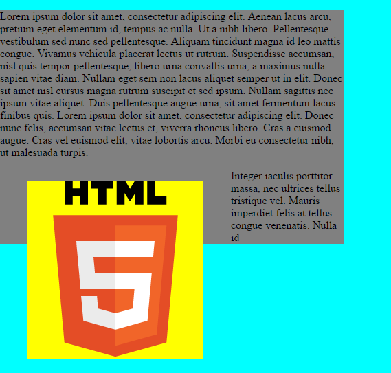
The above example should make the float behavior more clear. The floated element (figure) is removed
from the container (article) element and positioned as if it were there. Similarly the content of
the container element is adjusted as if the floated element was there. This allows the rendering engine
to maintain both elements as rectangular boxes.
If you want to have the container element to extend with the contained elements, you have to apply Clearfix (shorter explanation). The Clearfix is a CSS rule (yes, it is a rule so special, that it has its own name) looks like this:
.outer::after {
 	content: "";
  	display: block;
  	clear: both;
}
The ::after selector is a pseudo-element.
Pseudo-elements represent special places in document content (remember what pseudo-classes are?). The
distinction between pseudo-element and pseudo-class is that pseudo-element use two semicolons :: (but they
are also accepted with one semicolon, so :after). The rule works so that it virtually creates another element
after the list child of .outer element. That virtual element has no content content: "" and stops the
floating clear: both and switches layout mode to block layout. The same could be (and for older browser was)
achieved by a special element in HTML code, which would stop floating. It is not that important to know how Clearfix works,
but it is a nice illustration of immense CSS capabilities. The important thing is that it ensures that the container
grows with the floats.
Floating blocks are mainly useful for textual documents (as shown in the above example), but it has other uses too – e.g. if you replace the yellow boxes in the above example with photos, you’ll get a nice photo gallery. For more complicated layouts, the flex layout is a better solution.
Column layout
Similarly to float layout, the column layout is an extension to block layout and is designed mainly for text layouts. In the below example, the text is split into three columns:
<!DOCTYPE html>
<html>
    <head>
        <meta charset='UTF-8'>
        <title>Sample page</title>
        <link rel='stylesheet' href='style-13a.css'>
    </head>
    <body>
        <article>
            <p>
                Lorem ipsum dolor sit amet, consectetur adipiscing elit. Aenean lacus arcu, pretium eget elementum id, tempus ac nulla. Ut a nibh libero. Pellentesque vestibulum sed nunc sed pellentesque. Aliquam tincidunt magna id leo mattis congue. Vivamus vehicula placerat lectus ut rutrum. Suspendisse accumsan, nisl quis tempor pellentesque, libero urna convallis urna, a maximus nulla sapien vitae diam. Nullam eget sem non lacus aliquet semper ut in elit. Donec sit amet nisl cursus magna rutrum suscipit et sed ipsum. Nullam sagittis nec ipsum vitae aliquet. Duis pellentesque augue urna, sit amet fermentum lacus finibus quis. Lorem ipsum dolor sit amet, consectetur adipiscing elit. Donec nunc felis, accumsan vitae lectus et, viverra rhoncus libero. Cras a euismod augue. Cras vel euismod elit, vitae lobortis arcu. Morbi eu consectetur nibh, ut malesuada turpis.
            </p>
            <figure class='left'>
                <img src='https://www.w3.org/html/logo/downloads/HTML5_Logo_256.png' alt='HTML 5 Logo'>
            </figure>
            <p>
                Integer iaculis porttitor massa, nec ultrices tellus tristique vel. Mauris imperdiet felis at tellus congue venenatis. Nulla id diam ac diam scelerisque scelerisque. Ut tempor auctor nibh, vitae porta orci tempor ac. Mauris dolor mi, porttitor at venenatis vitae, tempus sed risus. Suspendisse sit amet consequat erat. Mauris aliquam quam non est convallis, in viverra elit sagittis. Quisque vestibulum porta dolor. Donec quis risus in ligula sollicitudin dictum ac a turpis. Pellentesque mattis id nibh commodo fringilla. Sed a posuere ligula. Phasellus nec augue vulputate, pharetra elit a, fringilla purus.

                Phasellus vel varius orci, nec vestibulum nunc. Ut metus quam, scelerisque ut consectetur ut, tincidunt sed nunc. Integer dapibus massa non arcu molestie iaculis. Fusce pretium scelerisque augue. Vestibulum dignissim neque mi, quis porttitor purus varius non. Aenean nec auctor magna. Nunc non lorem dictum, accumsan diam eget, facilisis nunc. Fusce imperdiet placerat est, eget auctor nisi ultricies non. Ut ac felis rutrum, malesuada lectus eget, tincidunt nisl. Morbi cursus lorem eu est suscipit pulvinar. Cras elit justo, condimentum non risus nec, efficitur pulvinar sem. Proin viverra mauris eu elit consequat lacinia. Etiam tincidunt vehicula metus in ornare.

                Sed quis ipsum porta, malesuada lectus ac, hendrerit felis. Vestibulum ante ipsum primis in faucibus orci luctus et ultrices posuere cubilia Curae; Etiam ullamcorper augue in turpis tincidunt, nec interdum purus volutpat. Ut at magna at nibh efficitur feugiat. In sed ipsum lectus. Nunc eleifend quam id neque semper, sed cursus eros dictum. Donec elementum, neque eu ultrices vulputate, metus sapien condimentum ipsum, vel aliquet lacus diam vel lectus. Vestibulum sed commodo nibh. Nunc in volutpat eros. Quisque condimentum ultrices pulvinar. Vestibulum venenatis efficitur orci id suscipit. Nam varius arcu sit amet cursus faucibus. Donec fermentum orci dolor, id porttitor turpis consequat vel.
            </p>
            <figure class='right'>
                <img src='https://www.w3.org/html/logo/downloads/HTML5_Logo_256.png' alt='HTML 5 Logo'>
            </figure>
            <p>
                Phasellus accumsan volutpat leo, quis rutrum urna posuere et. In egestas ullamcorper nibh, quis dapibus dui porttitor nec. Mauris eu neque a nunc faucibus auctor finibus ut risus. Integer a ipsum quam. Morbi euismod urna vitae neque consequat varius eget vel magna. Sed facilisis faucibus sapien, ut faucibus ex iaculis vitae. Donec gravida arcu laoreet massa cursus, a tincidunt neque feugiat. Morbi lectus nisl, tristique vitae tellus vel, consectetur rutrum velit. Quisque sit amet ipsum luctus, sollicitudin diam id, fringilla ligula. Donec semper dignissim elementum. Aliquam at facilisis nibh, nec accumsan diam. Cras gravida ipsum vitae feugiat tristique. Maecenas euismod fringilla risus non pretium.
            </p>
        </article>
    </body>
</html>body, html {
margin: 0;
background-color: cyan;
}
article {
column-count: 3;
background-color: blue;
border: 50px solid magenta;
margin: 50px;
}
img {
width: 100px;
}The columns are primarily set using the column-count property. There are also
other properties
to tweak how the columns behave. You should see an output simirlar to this one:
The column layout is primarily useful for splitting text into columns, if you want to put other blocks in columns, you should see the flex layout.
Inline layout
The inline layout is designed for sizing elements inside a flow of text. Inline layout
is default for inline elements (a, span, strong, em, …). It is special in that the
height of the element is controlled by the line height. This means that setting e.g. height or
margin-top does nothing, because the element is sized to fit inside the line. However the
box model still applies, which means that border and padding are addded to the element
height (which is line height). This means that they interfere with the surrounding text:

The above was generated using the following HTML:
<!DOCTYPE html>
<html>
    <head>
        <meta charset='UTF-8'>
        <title>Sample page</title>
        <link rel='stylesheet' href='style-14a.css'>
    </head>
    <body>
        <article>
            <p>
                Lorem ipsum dolor sit amet, consectetur adipiscing elit. Aenean lacus arcu, pretium eget elementum id, tempus ac nulla. Ut a nibh libero. Pellentesque vestibulum sed nunc sed pellentesque. Aliquam tincidunt magna id leo mattis congue. Vivamus vehicula placerat lectus ut rutrum. <span class='specialText'>Suspendisse accumsan, nisl quis tempor pellentesque, libero urna convallis urna</span>, a maximus nulla sapien vitae diam. Nullam eget sem non lacus aliquet semper ut in elit. Donec sit amet nisl cursus magna rutrum suscipit et sed ipsum. Nullam sagittis nec ipsum vitae aliquet. Duis pellentesque augue urna, sit amet fermentum lacus finibus quis. Lorem ipsum dolor sit amet, consectetur adipiscing elit. Donec nunc felis, accumsan vitae lectus et, viverra rhoncus libero. Cras a euismod augue. Cras vel euismod elit, vitae lobortis arcu. Morbi eu consectetur nibh, ut malesuada turpis.
            </p>
        </article>
    </body>
</html>
and CSS style:
body, html {
	font-family: "Times New Roman";
    font-size: 16px;
    margin: 0;
    background-color: cyan;
}
article  {
    background-color: blue;
    border: 50px solid magenta;
}
.specialText {
	margin-left: 50px;
	margin-top: 50px;
	padding: 10px;
	background-color: white;
	border: 20px solid yellow;
}
Line height (line-height property) is
by default set to value normal. You can see that in the above example between computed styles.
This means a that the line-height is guided by the used font (font-family). For the Times New Roman
family I used in the example, line-height normal is 1.15. That means 1.15 times bigger than the specified font
size. Therefore the line-height is 16px ✕ 1.15 = 18.4px. Then you need to add 2 ✕ 10px (padding)
and 2 ✕ 20px (border) which yields 78.4 px as the required height of the line:
body, html {
	font-family: "Times New Roman";
    font-size: 16px;
    margin: 0;
    background-color: cyan;
}
article  {
    background-color: blue;
    border: 50px solid magenta;
}
.specialText {
	margin-left: 50px;
	margin-top: 50px;
	padding: 10px;
	background-color: white;
	border: 20px solid yellow;
}
If you want every line to have the same height, you (obviously?) need to set the line-height property
for the entire article element. You can switch any element to inline layout by setting
display: inline property. You need to be aware of the
special box model handling though.
Table layout
As the name suggests, table layout is designed for rendering tables. Table layout accommodates to
size of the content, first vertically and then horizontally. I.e. table cell width extends with cell
content up to maximum width which would still fit into the table, then the cell height grows.
Table layout mode technically uses several display property values:
tablefor thetableelements,table-row-groupfor thetheadandtbodyelements,table-rowfortrelements,table-cellfortdandthelements.
Setting the above display modes (and few others) allows you to imitate the behavior of HTML tables. It is possible to use this instead of writing tables in HTML. HTML tables should be used to represent only semantic tables – i.e. it should contain only data whose meaning is a table. Consider the following form:
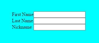
It is not semantically correct to put the form in a table and td elements, because it is not
truly a table. Yet it makes sense to display it in a form of a table. It can be done with a HTML like this:
<!DOCTYPE html>
<html>
    <head>
        <meta charset='UTF-8'>
        <title>Sample page</title>
        <link rel='stylesheet' href='style-15b.css'>
    </head>
    <body>
        <form class='tabularForm'>
            <div>
                <label for='first_name'>First Name</label>
                <input id='first_name' name='first_name' type='text'>
            </div>
            <div>
                <label for='last_name'>Last Name</label>
                <input id='last_name' name='last_name' type='text'>
            </div>
            <div>
                <label for='nickname'>Nickname</label>
                <input id='nickname' name='nickname' type='text'>
            </div>
        </form>
    </body>
</html>
And a CSS like this:
body, html {
    margin: 20px;
    background-color: cyan;
}
form.tabularForm {
	display: table;
}
form.tabularForm label {
	display: table-cell;
}
form.tabularForm input {
	display: table-cell;
}
form.tabularForm div {
	display: table-row;
}
Notice the use of combined selector form.tabularForm label which selects all labels which
are children of form.tabularForm. Using tables for non-tabular data is quite
controversial. Still, table layout
mode may prove to be useful in many scenarios.
Also it can be misused in a lot of scenarios, where a flex layout would be simpler solution.
Positioned layout
Positioned layout is designed to place elements to certain coordinates irrespective of content.
The positioning (position property) can be:
relative– the element is positioned relative to where it would be,absolute– the element is positioned relative to its closest positioned parent,fixed– the element is positioned relative to browser window,static– default positioning, the element is positioned after its preceeding sibling (i.e. elements are positioned as they are written down in the HTML document – hencestatic).
Relative position
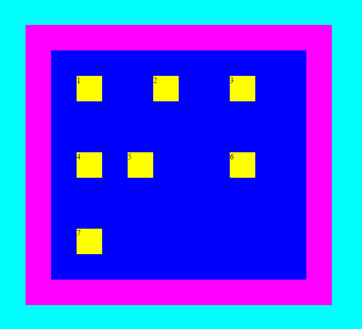
You can see how relative positioning works on the example with floats:
<!DOCTYPE html>
<html>
<head>
<meta charset='UTF-8'>
<title>Sample page</title>
<link rel='stylesheet' href='style-16a.css'>
</head>
<body>
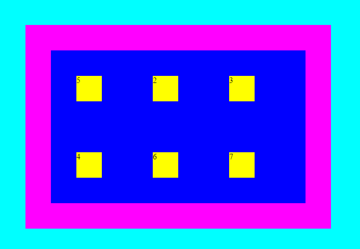
<div class='outer'>
<div class='inner'>1</div>
<div class='inner'>2</div>
<div class='inner'>3</div>
<div class='inner'>4</div>
<div class='inner' id='special'>5</div>
<div class='inner'>6</div>
<div class='inner'>7</div>
</div>
</body>
</html>And a CSS like this:
body, html {
	margin: 0;
	background-color: cyan;
}
.inner {
	background-color: yellow;
	width: 50px;
	height: 50px;
	margin: 50px;
	float: left;
}
.outer  {
	background-color: blue;
	border: 50px solid magenta;
	margin: 50px;
	width: 500px;
}
.outer::after {
 	content: "";
  	display: block;
  	clear: both;
}
#special {
	position: relative;
	left: -50px;
}
The element in the middle has class special which moves it
50 pixels to the left of its original position:
#special {
	position: relative;
	left: -50px;
}
Absolute position
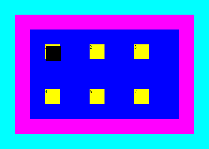
If you modify the #special element to:
#special {
	position: absolute;
	left: 0px;
	top: 0px;
}
You’ll see a result like this:
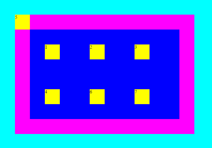
Notice two things: First, the element left it’s parent – you can see that the other
.inner elements have been rearranged. Second, the element position should be
positioned at coordinates 0, 0 from top left corner, but it is positioned at
50, 50. This is because the .inner element has margin: 50px. That is,
the position (top, left) refers to the margin edge, while the
size (width, height) refers to the content edge. You have to do
the math on your own.
In the above, there is no explicit positioned parent for the element #special. In that case, the
closest positioned parent is body. See what happens when you add position: absolute to the
container .outer.
body, html {
	margin: 0;
	background-color: cyan;
}
.inner {
	background-color: yellow;
	width: 50px;
	height: 50px;
	margin: 50px;
	float: left;
}
.outer  {
	background-color: blue;
	border: 50px solid magenta;
	margin: 50px;
	width: 500px;
	position: absolute;
}
.outer::after {
 	content: "";
  	display: block;
  	clear: both;
}
#special {
	position: absolute;
	left: 0px;
	top: 0px;
}
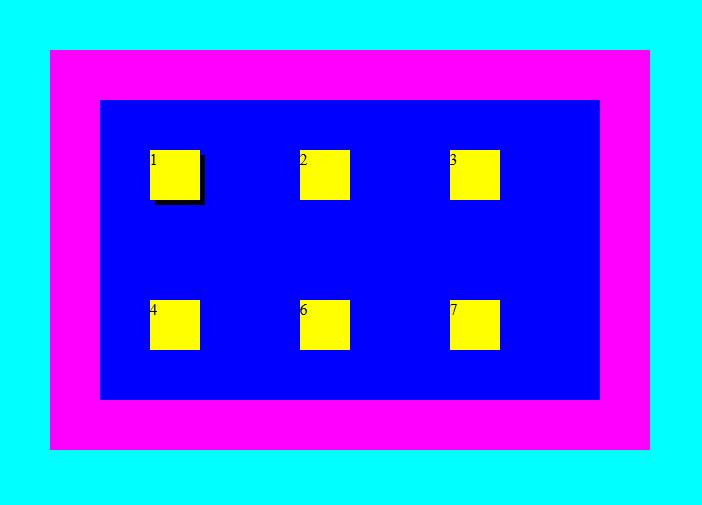
The #special element now overlaps the first yellow box (notice there is number 5 instead of 1). This
is because it is positioned at coordinates 0, 0 relative to the content of the .outer element
(because that is the closest parent of #special which has position: absolute). This is pretty
important, because it means that the absolute positioning mode is not really absolute. Also it means that
if you have a absolutely positioned elements inside a page and you add position: absolute to some
of their parents, the entire layout will break to pieces.
Stacking
When working with positioned elements (positioned otherwise than static) it becomes to take notice of
element stacking. So far, I told you that child elements are drawn over their parents
with transparent background (unless specified otherwise) so that the parents can be seen through.
This describes the default static positioning a default Stacking order. Stacking order can be
modified by seting the z-index property, but only if the element
position is not static.
Let’s change the #special element color and offset it a bit so that you can see the overlap more clearly:
body, html {
	margin: 0;
	background-color: cyan;
}
.inner {
	background-color: yellow;
	width: 50px;
	height: 50px;
	margin: 50px;
	float: left;
}
.outer  {
	background-color: blue;
	border: 50px solid magenta;
	margin: 50px;
	width: 500px;
	position: absolute;
}
.outer::after {
 	content: "";
  	display: block;
  	clear: both;
}
#special {
	position: absolute;
	background-color: black;
	left: 5px;
	top: 5px;
}
Now, you can start experimenting with Stacking order (z-index property). Default Stacking order value is auto,
which means that it is inherited from parent element.
This ultimately leads to html element which has z-index: 0. Higher z-index values bring the element to front,
lower (negative) values push the element back. So lets push back the #special element behind the first yellow box.
You can set z-index: -5 (the negative value is completely arbitrary) on #special element and you will see that
it disappeared completely. That is because it was pushed behind all elements with z-index: 0 which also
includes the .outer element. In short, the #special element hides behind parent. To fix that, you need to specify
z-index: -10 on the .outer element.
body, html {
	margin: 0;
	background-color: cyan;
}
.inner {
	background-color: yellow;
	width: 50px;
	height: 50px;
	margin: 50px;
	float: left;
}
.outer  {
	background-color: blue;
	border: 50px solid magenta;
	margin: 50px;
	width: 500px;
	position: absolute;
	z-index: -10;
}
.outer::after {
 	content: "";
  	display: block;
  	clear: both;
}
#special {
	position: absolute;
	background-color: black;
	left: 5px;
	top: 5px;
	z-index: -5;
}
The above works, but if you experiment with it, you’ll run into some peculiarities. E.g. setting
.outer z-index to 10 would not bring it above the yellow boxes or setting #special stacking order
to -20 would not bring it behind its parent. This is because stacking order (z-index) is not
simply a single global height. In fact, stacking of elements is one of the most complicated parts of CSS
If you are interested more in it, here are some resources:
- Walkthrough article,
- Another article,
- CSS wiki,
- the CSS specification,
- an appendix to the specification.
Absolute position with proper stacking is often used for modal dialogs which need to overlap everything else on a page.
Fixed position
Fixed positioning can be used to position an element relative to viewport. To understand what viewport is, you need a bigger (scrolling page) and you can imagine that you are looking at it through telescope or microscope. The viewport is the window through which you see the page and you move the viewport to the desired page part by scrolling. Simply said, viewport is the area you are currently viewing. It is not correct to say that viewport is the browser window, because viewport is created for any scrolling area.
You can see how fixed position is used in the following example:
<!DOCTYPE html>
<html>
    <head>
        <meta charset='UTF-8'>
        <title>Sample page</title>
        <link rel='stylesheet' href='style-17a.css'>
    </head>
    <body>
        <div class='outer'>
            <div class='inner'>1</div>
            <div class='inner'>2</div>
            <div class='inner'>3</div>
            <div class='inner'>4</div>
            <div class='inner' id='special'>5</div>
            <div class='inner'>6</div>
            <div class='inner'>7</div>
        </div>
    </body>
</html>body, html {
margin: 0;
background-color: cyan;
}
.inner {
background-color: yellow;
width: 50px;
height: 50px;
margin: 50px;
}
.outer {
background-color: blue;
border: 50px solid magenta;
margin: 50px;
width: 500px;
}
#special {
position: fixed;
bottom: 0;
right: 0;
}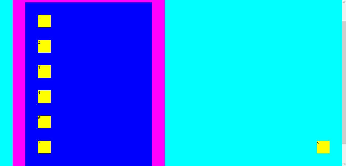
Notice that the element is positioned from bottom right corner and its margin still applies. You need to test that above example on your own and see that the yellow box number five stays attached to the viewport and does not scroll. Fixed position is widely used for ‘sticky’ things like alerts and advertisements.
Flex layout
Flex (flexible boxes) layout is a new addition to CSS standard introduced in CSS3. It addresses the issues which are mainly connected with layouting applications. CSS and HTML were primarily designed for layouting text pages which means that the other layout modes oriented in on direction (block & table in vertical, inline in horizontal). The flex layout is direction agnostic – it does not prefer one direction over the other. This makes the flex layout mode very suitable for application layouts (particularly responsive applications, but unfortunately it also makes it a lot more abstract.
To recreate the example with floats using flex layout, you can use the following code:
<!DOCTYPE html>
<html>
    <head>
        <meta charset='UTF-8'>
        <title>Sample page</title>
        <link rel='stylesheet' href='style-18a.css'>
    </head>
    <body>
        <div class='outer'>
            <div class='inner'>1</div>
            <div class='inner'>2</div>
            <div class='inner'>3</div>
            <div class='inner'>4</div>
            <div class='inner' id='special'>5</div>
            <div class='inner'>6</div>
            <div class='inner'>7</div>
        </div>
    </body>
</html>body, html {
margin: 0;
background-color: cyan;
}
.inner {
background-color: yellow;
width: 50px;
height: 50px;
margin: 50px;
}
.outer {
background-color: blue;
border: 50px solid magenta;
margin: 50px;
width: 500px;
display: flex;
flex-flow: row wrap;
}
The display: flex; property switches the layout mode of .outer div to flexible container.
All children of that element become flexible boxes. The property flex-flow: row wrap; defines that
the flexible boxes will be arranged in wrapping rows.
The flex layout is a great tool that can be used for a wide range of layouts, you can see:
Summary
In this article I tried to describe the various systems used to actually draw HTML elements on a computer screen. Mastering CSS layouts is no easy task and describing all the possibilities would fill many books. You should start with already created page and layout templates, there is no shame in that. However it is good to have a general idea how they work.
New Concepts and Terms
- box model
- content edge
- margin edge
- layout mode
- block layout
- inline layout
- positioned layout
- table layout
- flex layout
- float
- relative positioning
- absolute positioning
- stacking
- stacking order (
z-index) - fixed position
- viewport